Case Study
amer
Arcade APP
UX/UI Case Study
Gamer App is a gaming arcade app designed for users to give them premium experience and book games smoothly .

Gamer
Play arcade games with convenience and with waiting in queue and money hassle.
Market research
Competitive analysis
User survey
Personas
Storyboarding
Crazy 8s
User journey map
Flow diagram
Lo-fi wireframes
Alignment and grid
Hi-fi UI
Prototype
Mini usability study
Accessibility evaluation
Project Overview
Description
Gamer App is a platform where people will be able to book aracade games online, get latest updates, save their game cards in app and get latest offers and compete in tournaments and top leaderboard.
My Role
Research
Wireframe
User Flow
User Persona
UI/UX Design
WHY I CREATED THIS APP
I’m creating this mobile applictaton to help users to preview games in an arcade, saving arena cards and book games online.The app will save time and improve the experience and improve their gaming experience of arcades.

Market research
THE CLAIM
Gaming arenas are becoming more and more popular.
According to research, gaming arenas are mostly preferred by every age people as a break through hard life and have fun.
THE PROBLEM
With the arrival of the covid-19 pandemic, people avoiding too much contacts with each other.
Arenas have no separate apps of their own.
Arenas change rules, payment method and add new games but that’s unknown to people.
Most of the arenas don’t provide online booking facility.
Competitive analysis
I downloaded and then analysed three apps, one of which are my direct competitor and two are indirect. I compared the app experience of each competitor’s app as a new user and a returnng user. What’s more,I also just exposed negative comments from the App store and Android App Store to get the essence of what the users struggle with the most while using them and what they are not too keen on.


Smaash
THE GOOD
Well designed and minimalist design.
Provide live score tracking.
Loyalty rewards.
THE BAD
Low features , loading failures.
App failure , low features , no discoverability.
Unable to book through app.
E7 Play
THE GOOD
Well designed , well explained price , booking and card features.
Well structured.
Pre-booking/cancellations , memberships , red card , fare prices.
THE BAD
Currency , language , location barriers.
Noise , some clutter and unnecessary information.
English and Taiwan language only.


Sandbox VR
THE GOOD
Minimalist design.
Provide booking and gift card facility.
Clear booking.
THE BAD
Redirects to official website for booking.
Don't show country availability till last.
No exploration
Problems from the comments
You can’t see nothing except score board.

Ritvik
No online booking system.No offer notifications.
Astha

Some games requires coins and some needs cards.
Andrew

User survey
I conducted a quick survey among people who visit gaming arcades and use it’s app with a tracking system on a regular basis on Facebook.
What are the problems you face in a gaming arcades you visited so far ?
15 participants
Crowd
30 %
Queue
50 %
No online booking
50 %
Payment issues
40 %
Card handling issues
60 %
Other
5 %
Notable comments
Handling card is a big mess.
Arun

Bigger the crowd, bigger the queue.
Yash

I wish to book arcade games like booking movie tickets.
Pulkit


INITIAL RESEARCH RESULTS
As the carried out research shows, there is a growing need for gaming arcade apps, and every company that provides services should have one such app.
Personas
I created a persona of 5 people combinely to help me explore the needs of a larger group of users and design my app with specific target usersin mind.
Goal
Online booking.
Security in transactions.
Card saving facility.
Offers.
Slick interface.
Feel like R.G.B lights.
Frustrations
Long queue.
Security issues.
Losing arena cards.
No offers or tournament updates.
Boring interface.
Don’t feel relevant experience.
Age: 29
Status: Unmarried
Occupation: P.G. student
Location: India
Rajdeep singh

Rajdeep is a P.G. student, who likes to visit gaming arcades with friends as a weekend plan and travels different places to explore new arcades around.
Influences
Friends.
Online & social media.
Gaming community.
Personality
Introvert.
Quick response.
Decent.
Technology
Tech savvy.
IOS user.
P.C. gamer.

TIME TO START DESIGNING
Once I went into my user’s head, it was time to sketch out the first flows and the initial low- fidelity wireframes, as well as a prototype based on them.
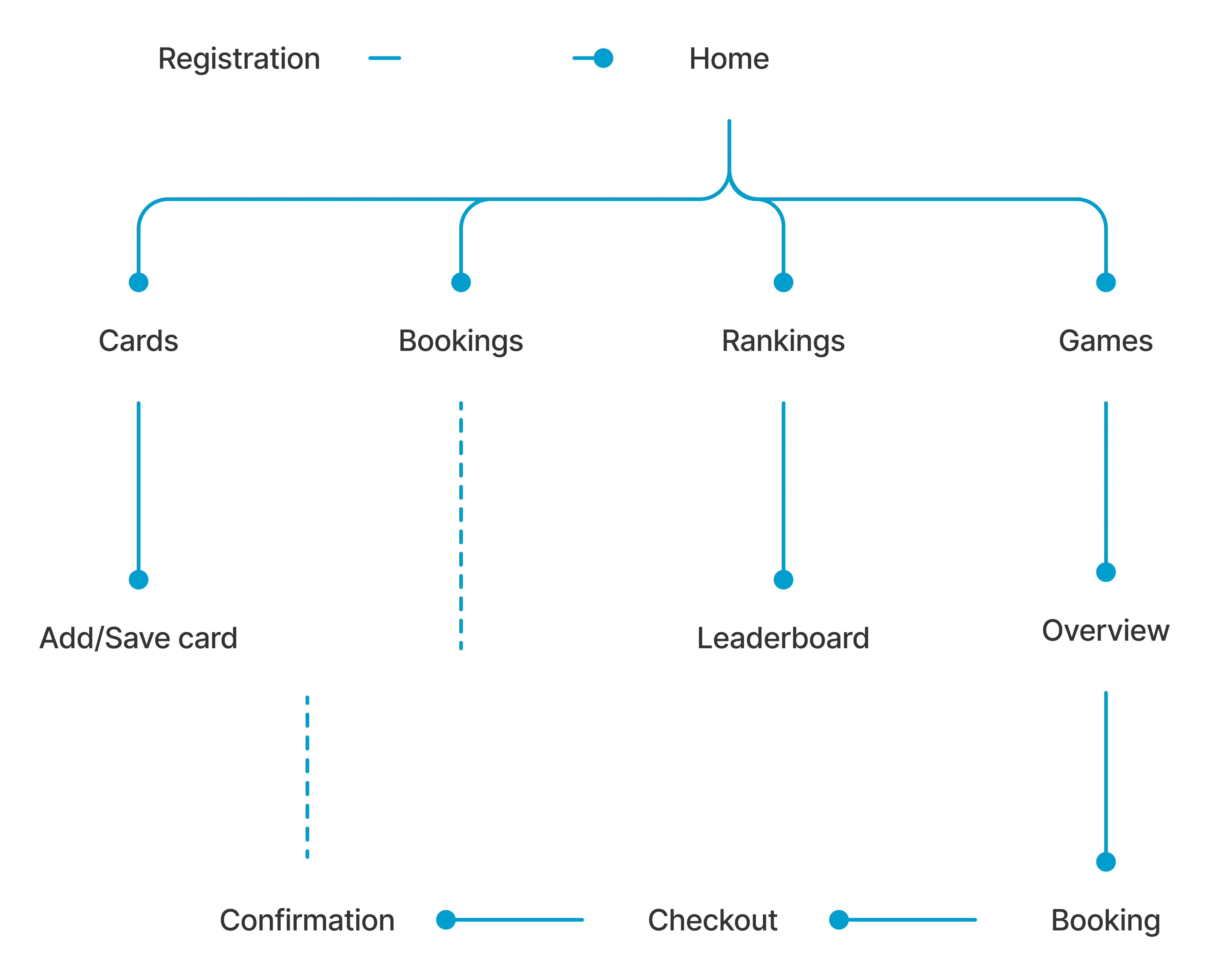
Flow diagram
To outline all the necessary functionality, I created a simple flow diagram of the main tasks the user can do. One of the flows is shown below. Fall state flows were also created, but are not shown due to space constraints.
Main user flow
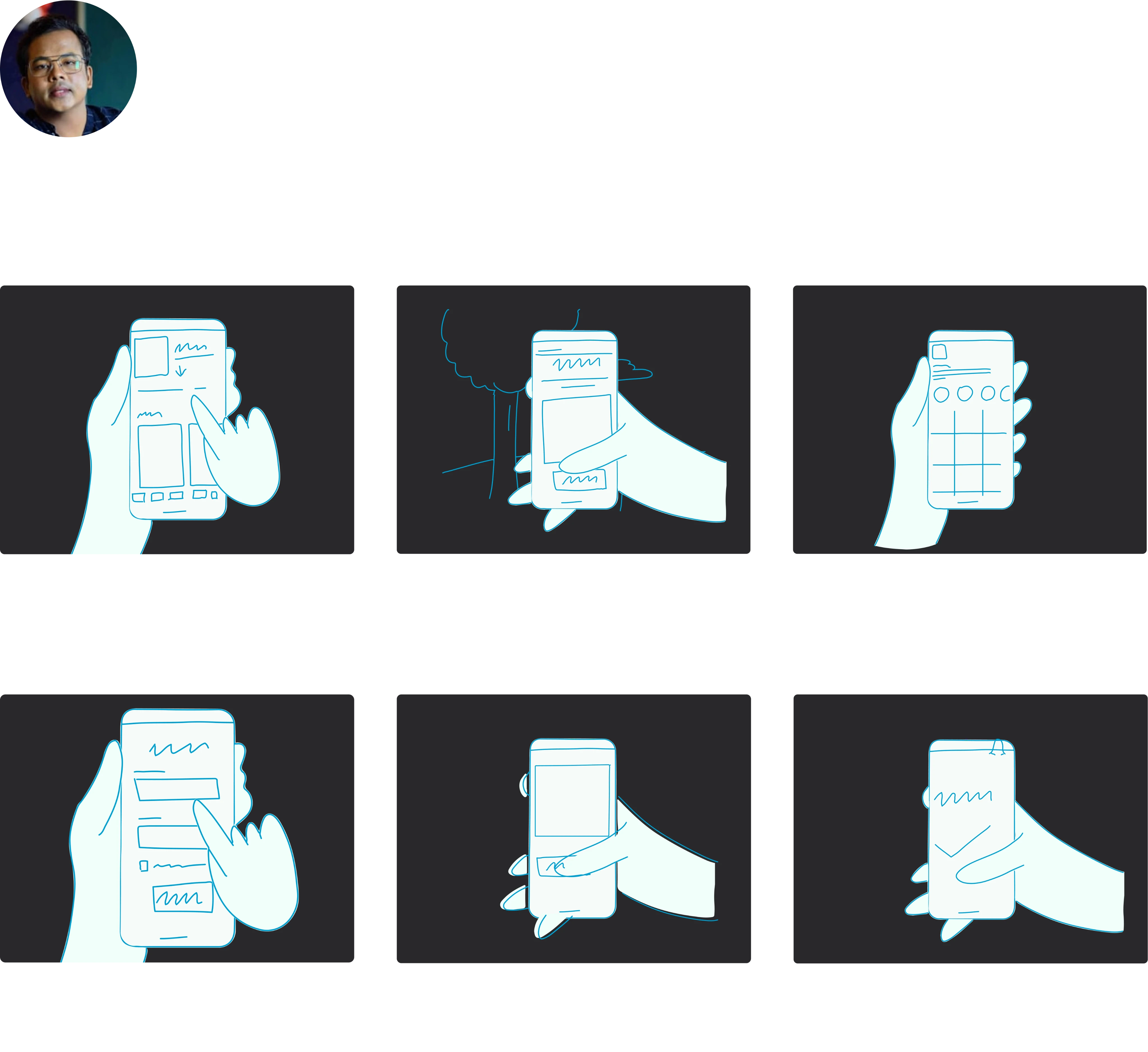
Wireframe and initial insights
Once the user flow was established, I started sketching with pen and paper the low fidelity wireframes of the main user flow. However, due to space constraints, I decided to show only a couple of the digital lo-fi wireframes I designed. The initial wireframes were made to adapt to the Android users (as a form of following the Material Design’s guidelines).

Getting Feedback
After the lo- fi wireframes were designed, I made a prototype to test on a couple of users. I made aresearch plan where I outlined research goals, enlisted questions to be asked, KPIs, methodology, information about the participants, and a script with tasks to complete.
After collecting insightsfrom the participants, I made an affinity diagram to seek for a pattern in the participant’s behaviour and their frustration while going through the prototype.
Theen I made a usability study presentation to showcase the study’s quick recap, insights and recommendations.
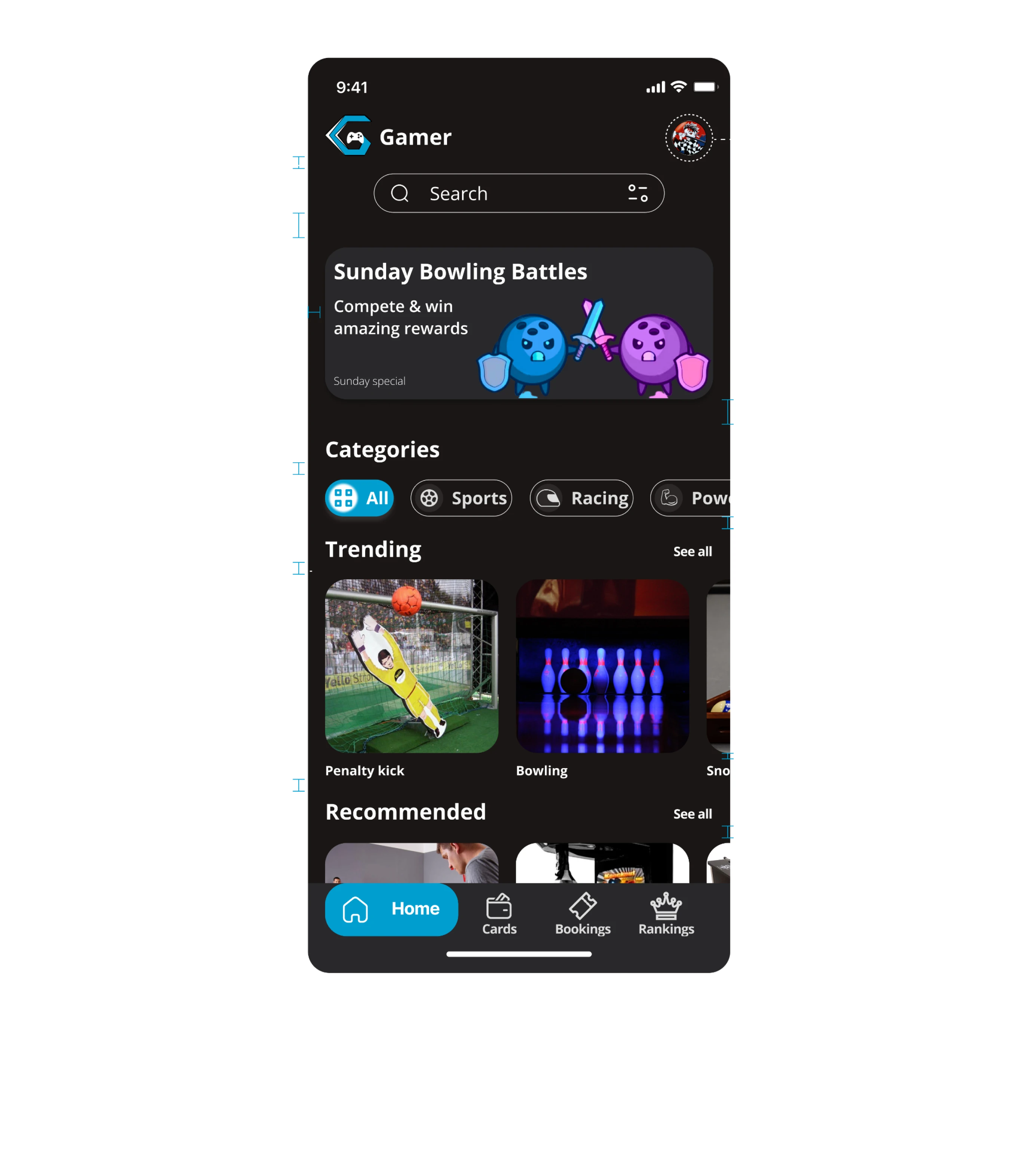
High-fidelity UI Design
Once the initial flow was completed and wireframes were ready, I started creating a couple of the main screens of the app. Choosing a typeface and a set of colours were the most important things. I created a simple UI Style Guide to maintain consistency. Thus, for colours I went with the HSL colour model to get exact tints and shadow of the main colours. Then I created a typography scale to ensure that the heirarchy throughout the project is preserved.
Colours
Primary
Secondary
Neutrals I
Neutrals II
Typeface
Inter
Regular, Medium, Bold
AaBbCcDdEeFfGgHh
Find my gamer inside
With slick and high quality cut-outs of the Gamer’s products, the feeling of real gaming app experience.


Wrong previous designs

Problems from the comments
You can’t see nothing except score board.
Ritvik
No online booking system.No offer notifications.
Astha
Some games requires coins and some needs cards.
Andrew
User Journey map
Next, I created a user journey map to identify the pain points and feelings the user go through while playing games and booking it online. I also enisted solutions to the problems my app would solve.
Persona
Goal
Action
Mood
Tasklist
Feelings
Painpoints
Improvement
opportunities
Discover
Onboarding
Browse game
Book game
Play game
Finds the arcade app
Installs Gamer app
Curious
No variety of good apps
Seperate arcade app to reduce load.
Opens app
Reads onboarding messages
Sign up/ Login
Excited
No app briefs during onboarding.
Brief information about app.
Browses games from home screen
Confused
Confusion among variety of games.
Categorize games.
Selects game
Select date & time
Duration, players
Select payment option
Pay
Happy
No onspot information.
Current bookings and status information.
Reach arcade show booking.
Play
Happy
Play with coins,cards or tokens.
Prefer booking user first.
User Journey map

Trying to play games in a gaming arcade
Alignment and grid
I used an 8-point grid system and a 4-point vertical grid for the project. I set the margin to 16, for the margins within groups, I used 8 and 16 with margins at 16. Also, all the designs were created using Constraints and Auto Layout to assure responsivity across different screen sizes.
High-fidelity prototype
I connected my hi-fi designs into a clickable prototype with some custom and in-built animations in Figma. That will allow me to test the app on the first group of users.
Overview
Book Now
Bowling
Bowling is a game in which you roll a heavy ball down a narrow track towards a group of wooden objects and try to knock down as many of them as possible.
400/Person
4.7
Extra lanes buyable onspot

9:41
Cards
Rankings
Booking
Home
Confirmation

Bowling
Monday,15 August 2022
01:00 P.M.
Smaash, D.B. Mall,Bhopal
4t.h Floor
9:41
Gamer
Search
Categories
Sports
Recommended
Penalty kick
Teqball
Bowling
Punching machine
Snooker
Foosball
Racing
Power
Strategy
See all
See all
Sunday bowling battles


Compete & win amazing rewards
Sunday special


Sports
All
Bookings
Cards
Home
Rankings

9:41
Prototype validation
After the prototype was created, I tested it on 5 users. I made a research plan where I outlined research goals, questions I wanted to know the answer from, KPIs, methodology, information about the participants and a script with the task to complete. Mainly I wanted to be sure that the booking process is smooth without any friction and leads to the game being booked and that later the user knows when and how the product can be picked up. This was tested and carried on in-person using Figma’s prototype mirror share app.
The tasks included booking one game’s sub category and completing checkout through UPI payment. Side tasks included adding arcade card. Throughout the tasks, I asked the users to talk through their thought process and speak out when something is unclear or makes them irritated.
After the usability study, I asked the participants to complete a short System Usability Scale questionnaire.
After collecting insights from the participants, I made an affinity diagram to organize a large number of ideas into their natural relationships.
Then I made a usability study presentation to showcase the study’s insights and recommendations.
Gamer
Search
Categories
Trending
Recommended
Penalty kick
Teqball
Bowling
Punching machine
Snooker
Foosball
Sports
Racing
Power
Strategy
All
See all
See all
Sunday Bowling Battles

Compete & win amazing rewards
Sunday special
Bookings
Cards
Home
Rankings
9:41
Study results
Many users were unable to find games, so we added categories, many were having old phones so we added N.F.C. detection to avoid pop up of device not supported, Improved UI because of gaming community expectations and much more.
Prototype update concept
New and more updated UI based on more research and usability studies, new features and new feature of arcade location of guide like maps will be introduced.
Accessibility check
The app has been evaluated for contrast to match at least AA standards. Every frame was checked with contrast checker tool, as the Figma plugin “A11y - Colour Contrast Checker” and then by hand with the “Contrast Checker” by WebAIM.


PROJECT SUMMARY
During the project, I managed to evaluate the market research, do a quick user servey, create a set of lo-fi wireframes, build them into hi-fi UI designs, connect them into a prototype and perform a mini usability study. This was a demanding and time consuming but very insightful journey. I learned a lot throughout the whole process but I’m not resting on my laurels. There is a lot of room for improvement and many things to learn.
Thank you for scrolling!
I really appreciate your time to check my case study out! I would be greatful to hear your feedback.
Abhishek Dambhale
Copyright © portfolioabhishek.com 2023. All rights reserved. All other trademarks are the property of their respective owners.